Creating a Dashboard Builder to empower our users
View PrototypeOVERVIEW
- Summary
COMPANY OVERVIEW
MediKeeper is a highly customizable, white labeled, wellness portal used by employers, health plans, and wellness companies.
This SaaS is comprised of a member user portal and an admin portal, where administrators can manage corporate wellness programs and implement health initiatives for their member users.PROJECT SUMMARY
Construct a dashboard builder so that administrators can create custom reports so they can easily visualize engagement and health metrics so that they can gauge impact from their wellness programs and health initiatives.
BACKGROUND
Existing reports were providing irrelevant information and lackluster data visualizations. Users were bypassing our reports and were opting to extract, convert, and consolidate aggregate data outside our reporting environment. Because our preset reports were not meeting administrators' needs, we opted for a custom dashboard builder in order to streamline report generation and allow bespoke reporting.
- Role & Responsibilities
UX/UI DESIGNER
- 60 day design period with 3 design reviews
- deliver mockups, an interactive prototype, graphics
- use Vueitfy UI Library and charts from Fusioncharts
- demo and handoff to development
- perform QA of dashboard UI and user interactions
- Problem STATEMENT
Administrators need to be able to create custom analytics dashboards so they can visualize data that is most relevant to them.
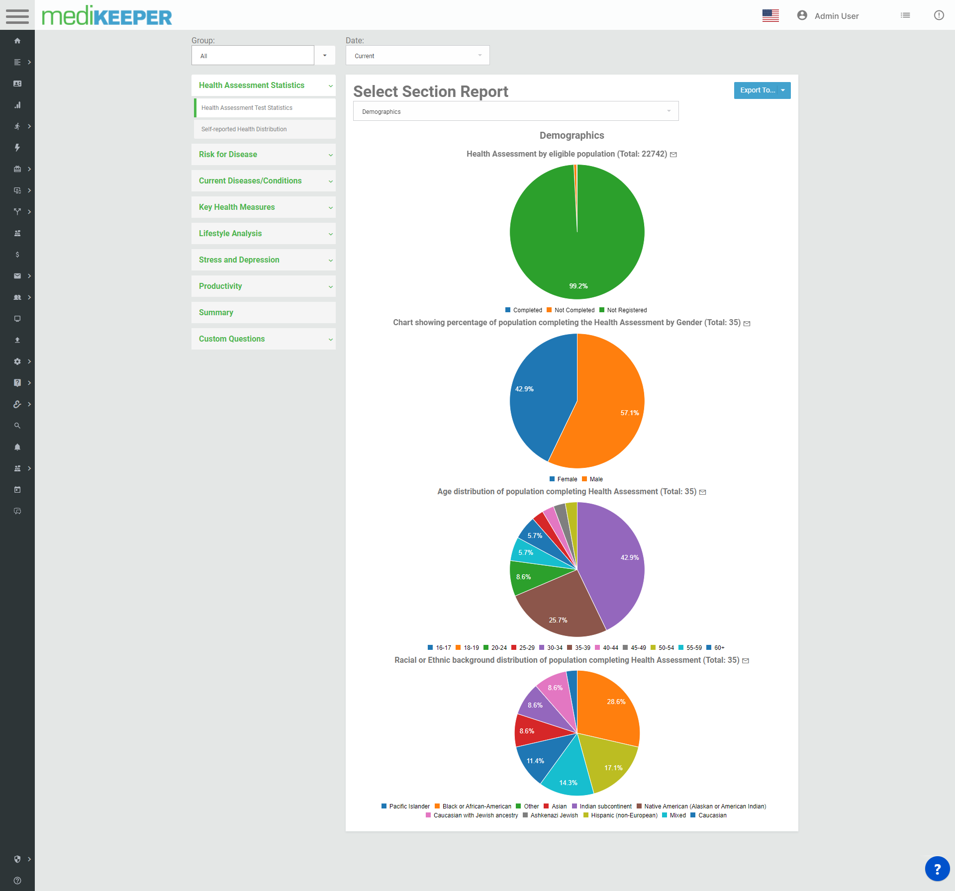
Health Assessment Statistics report pre-redesign
Process
- ObJECTIVE
BUILD A PLATFORM THAT ALLOWS USERS TO
- create, share, and export custom analytics dashboards
- save and revisit "evergreen" dashboards for better long term analysis and to reduce time spent generating and assembling reports
- filter the data by group(s) and time period(s)
- select from a comprehensive list of charts for single time periods and comparative charts that contrast multiple time periods
- share dashboard editing and viewing rights with other team members
- integrate enterprise messaging functionality so admins can communicate directly with segments of the user population
- export individual charts and/or entire dashboards
- create, share, and export custom analytics dashboards
- RESEARCH
MENTAL MODELS
I referenced other "canvas builders" like Jira's dashboard builder and Mailchimp's email generator for inspiration. These two popular products both contain a canvas and a library of graphical and text elements to drag and drop onto the board.


DESIGN PRINCIPLES
To promote human centered design, I implemented these established mental models, flexibility and efficiency of use, and user control and freedom, to allow optimal configuration of text and graphical elements.
When sketching the first draft, I considered these common laws of UX Design:Jakob's Law
Users spend most of their time on other sites, meaning they prefer your site to work the same way as other sites they use. Law of Common Region
Elements tend to be perceived into groups if they are sharing an area with a clearly defined boundary.Law of Proximity
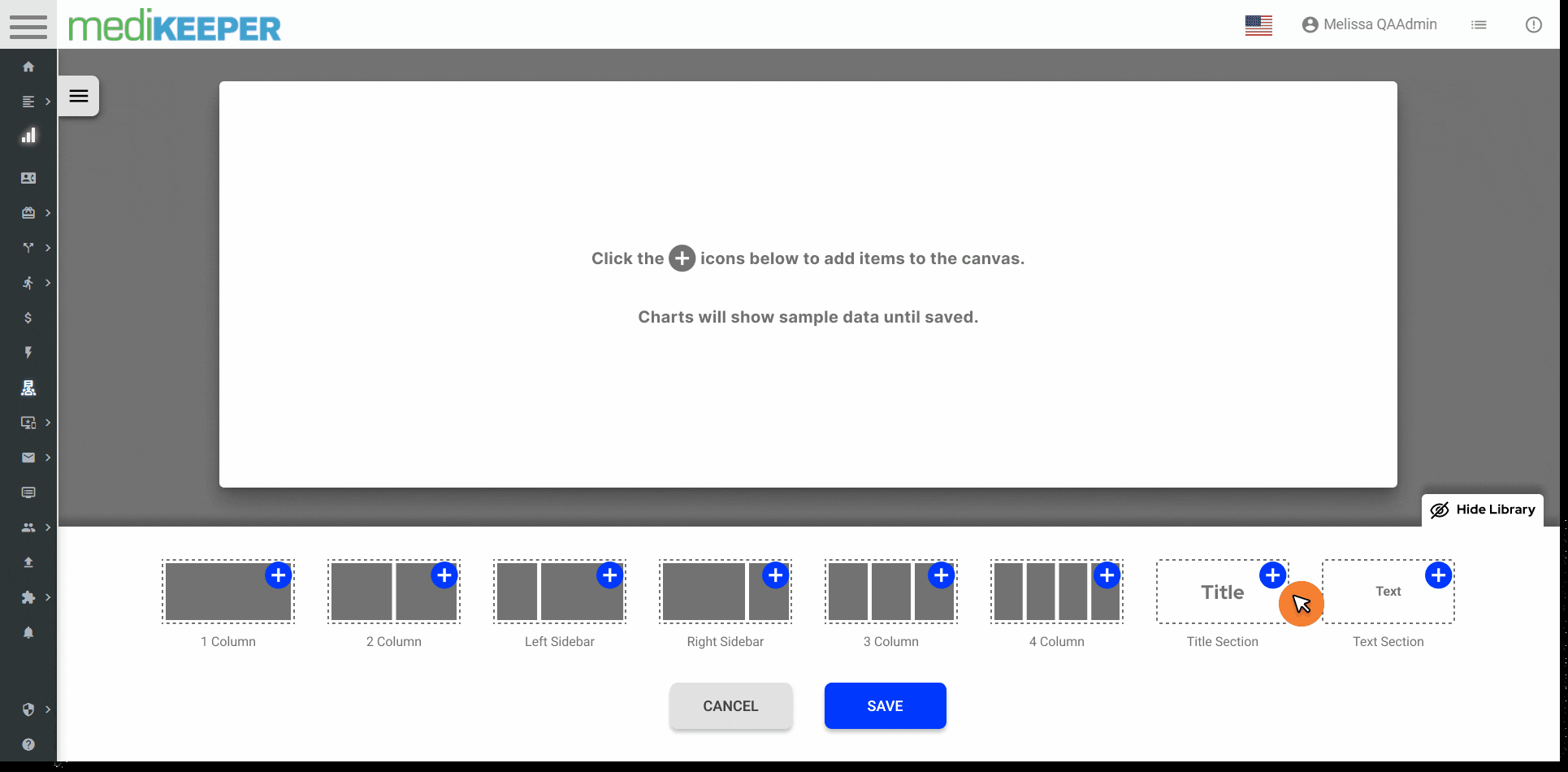
Objects that are near, or proximate to each other, tend to be grouped together.The library offered six chart container configurations and two text options so users could emphasize certain data points, and text to explain trends or anomalies.
Offering a variety of elements enables the users to export a report that's presentation ready.Jakob Nielsen, cites user control and freedom as one of the ten most important usability heuristics for web design.
CONSULTING THE USERS
At MediKeeper we have established a Product Advisory Board that consists of our internal Product Team and external client administrators, the people who use our product most.
At these monthly meetings we gather requirements, pitch solutions, demo MVP's, and solicit qualitative feedback. I demoed the clickable prototype and requested feedback for improved iterations.
Using KardSort, we asked users to sort which charts they would like to see implemented first, as we will be rolling out charts in an agile, batched approach.
The information gathered in these meetings proved the flow to be intuitive and usable, and directed the chart rollout based on consensus. - Solution
DESIGN HURTLES
One aspect of the flow proved to be a fun challenge that took some iterations to iron out.
Many of the builder wizards throughout the MediKeeper admin portal are multi-step builder forms that allow users to return back to previous steps, however, this proved to be very difficult and took multiple team efforts to arrive at a smooth user flow that eliminated any confusion for the users.
Figma is an extremely powerful too, but it can still be difficult to accomplish some tasks and interactions. During design reviews with product and development teams, I explain where I met prototyping/interaction limitations to ensure that the correct functions and interactions are captured in the Jira story cards.INTEGRAL CANVAS INTERACTIONS
- collapsible chart library drawer to maximize viewport of canvas when reviewing work
- add button on each chart library element to indicate it will be added to the canvas
- function to reorder text elements and chart containers with drag and drop
- function to delete text elements and chart containers
- modal to assign charts to the placeholders within the chart containers
- ability to edit chart assignment
- time stamp of edits made to dashboards when saved
- ability to set one dashboard as a default for page returns
- collapsible chart library drawer to maximize viewport of canvas when reviewing work
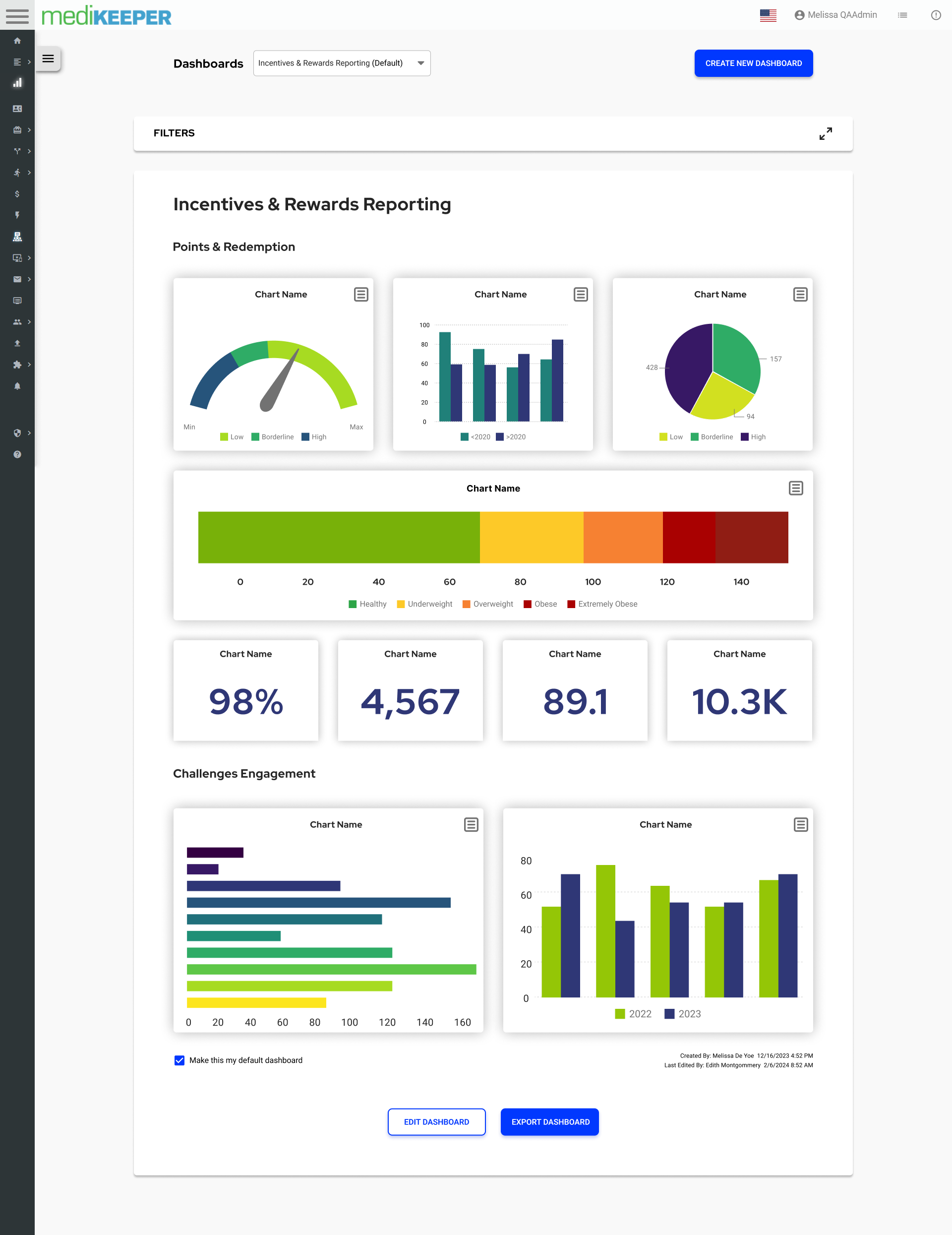
A custom built dashboard (mockup)
FINAL THOUGHTS
- OUTCOME
WHAT I WOULD HAVE DONE DIFFERENTLY
I should have performed a usability test of the product with the Product Advisory Board instead of demonstrating its common use cases.
That would have been a great way to elicit unbiased feedback, gauge the ease of the user flow, and to open a dialogue about any ambiguities in the design.
I made the mistake of presuming the design was intuitive instead of observing how the user journey would look with real users.